1. What skills have you developed through this module and how effectively do you think you have applied them?
I have learnt a lot about the print processes, all the colour for print module was relatively new stuff to me so I enjoyed it a lot. I have also learnt a lot more about photoshop, I have been trying to use shortcuts and explore all the different aspects of the program and as a result I feel I have improved decently. I feel I could of applied them both better to the work.
2. What approaches to generating work and solutions to problems have you developed and how have they helped?
I have recently started to try and plan what I will do, as I work better and sit around less when I do this. I have also tried to do work logically instead of getting straight onto a computer.
3. What strengths can you identify in your work and how have/will you capitalise on these?
I think some of the logo work and the rendering work is decent in my work, and this was helped by research so I think with more referencing my work could improve dramatically.
4. What weaknesses can you identify in your work and how could you exploit these more fully?
I should of spent more time exploring different options, as well as carrying good ideas through to a more advanced stage before abandoning them. I need to try and be a lot tidier with my work and keep everything organized neatly.
5. Identify five things that you will do different next time and what do you expect to gain from doing these?
I didn’t do enough work, I lost a lot of work due to disorganization over the long time of the project. I was complacent and I feel I was a little overambitious and I also chose a project on something I care little about, which I now regret. If I solve all this things my work would have been a whole lot stronger.
Attendance 4
Punctuality 3
Motivation 2
Commitment 3
Quantity of work produced 1
Quality of work produced 2
Tuesday, 25 November 2008
Friday, 6 June 2008
What is graphic design?!
Here ill be trying to answer the question of what is graphic design?
A good a start as any would be the wikipedia definition
"Graphic design is the process of communicating visually using text and images to present information. Graphic design practice embraces a range of cognitive skills, aesthetics and crafts, including typography, visual arts and page layout. Like other forms of design, graphic design often refers to both the process (designing) by which the communication is created and the products (designs) which are generated."
So what its saying is its getting a messege across visually, but its not just the final product that is graphic design, but the process leading up to that final product that is graphic design also.
theres a short video illustrating some of the key points of the process.
But graphic design is all around us, the world we live in has all been designed, by various different types of designer, graphic designer is in the broad field of anything visual, as a architech is a building designer and designs buildings in which to live in, a graphic designer designs graphics/imagery/visual information that is useful to the viewer/target audience.

Heres some very early graphic design from the book of kells, a book illustrated by celtic monks in 800ad of the new testament. The monks wanted to get across the glory of god within the pages and thus designed it to that effect, graphic design over a thousand years before the term was invented.
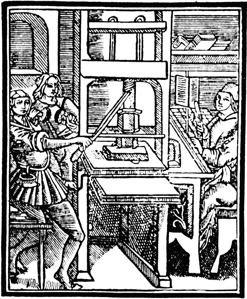
the gutenburg press (above) was the first printing press making mass multiple prints possible. whoever pieced together and carved the plates for it was a graphic designer.

Mondrian is credited with being one of the founding fathers of the "grid" system, commonplace in design today, in which all the elements on the page/surface are arranged according to each other on some kind of grid, works such as the one above by mondrian inspired this.
The term graphic design was first coined by William Addison Dwiggins, an American book designer in the early 20th century.
Graphic design moves through different styles and eras much like fine art does, as it tries to capture the publics need at the time.

bauhaus really founded modern graphic design, and was one of the first to teach more modern design principles, they're one of the most important schools in graphic design history. Outlaying may of the rules we still adhere to today.

constructivism came out of russia in the 1920's and was heavily linked to a political ideal. Its another example of a era of design.

this style of 1960's design is very recognisable, encompassing the free spirited nature of the era.

contempory design is a lot more open to anything, but it still has its styles, such as the grunge style above. now that everyone has access to computers, anyone with rudimentary knowledge can hash together some design, this is where it comes back to process, truely great design has great process behind it.
There are lots of rules to graphic design, and a saying that "you have to know the rules to break them", ill leave you with david carson's take on this.
A good a start as any would be the wikipedia definition
"Graphic design is the process of communicating visually using text and images to present information. Graphic design practice embraces a range of cognitive skills, aesthetics and crafts, including typography, visual arts and page layout. Like other forms of design, graphic design often refers to both the process (designing) by which the communication is created and the products (designs) which are generated."
So what its saying is its getting a messege across visually, but its not just the final product that is graphic design, but the process leading up to that final product that is graphic design also.
theres a short video illustrating some of the key points of the process.
But graphic design is all around us, the world we live in has all been designed, by various different types of designer, graphic designer is in the broad field of anything visual, as a architech is a building designer and designs buildings in which to live in, a graphic designer designs graphics/imagery/visual information that is useful to the viewer/target audience.
Heres some very early graphic design from the book of kells, a book illustrated by celtic monks in 800ad of the new testament. The monks wanted to get across the glory of god within the pages and thus designed it to that effect, graphic design over a thousand years before the term was invented.
the gutenburg press (above) was the first printing press making mass multiple prints possible. whoever pieced together and carved the plates for it was a graphic designer.
Mondrian is credited with being one of the founding fathers of the "grid" system, commonplace in design today, in which all the elements on the page/surface are arranged according to each other on some kind of grid, works such as the one above by mondrian inspired this.
The term graphic design was first coined by William Addison Dwiggins, an American book designer in the early 20th century.
Graphic design moves through different styles and eras much like fine art does, as it tries to capture the publics need at the time.
bauhaus really founded modern graphic design, and was one of the first to teach more modern design principles, they're one of the most important schools in graphic design history. Outlaying may of the rules we still adhere to today.
constructivism came out of russia in the 1920's and was heavily linked to a political ideal. Its another example of a era of design.
this style of 1960's design is very recognisable, encompassing the free spirited nature of the era.
contempory design is a lot more open to anything, but it still has its styles, such as the grunge style above. now that everyone has access to computers, anyone with rudimentary knowledge can hash together some design, this is where it comes back to process, truely great design has great process behind it.
There are lots of rules to graphic design, and a saying that "you have to know the rules to break them", ill leave you with david carson's take on this.
fun typography...

Tiziana Haug did these really nice wolff olins type pieces. They are fun, yet legible. each letter has obviously been carefully considered, i particularly like the sauce one, it has a sense of class to it, imagine someone did this is in a restaurant, i feel there are new frontiers in design, with things like food crafting and other obscure areas. Design can be anywhere.
sweet gifs

the animated gif. basicly a series of pictures ran through to form an animation. Overused in thee early days of the internet, they can now be used subtly and playfully to good effect. I really like the one above, keeping the focal point of the glow stick glasses but changing the face, gives a really good effect, echoing the new rave culture.
Monday, 2 June 2008
Benjamin Verdonck's Nest
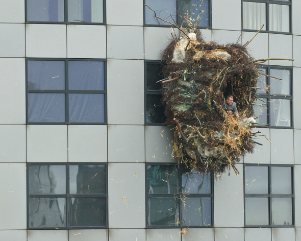
Benjamin Verdonck has created a giant nest on the side of a building in rotterdam. I love surreal art placements like this, they break you from the normal monotony of real life and make you think. This one was very well executed as well, being able to go inside it is another level of cool.
Giant plushies in hong kong

Seen on the streets of hong kong. I love this type of street art, it takes the normal wall drawing and adds another dimension. finding things like this when walking down the street are fun and cool, especially if not linked with the corporate.
packaging design...

really clever idea promoting hand washing to save trees. The trees on the print will fade if hot washed, but remain if hand washed. Cleverly illustrating the point.
Jake blanchard...

another brighton graduate this year, jake blanchard has a simple yet complicated, exciting visual style. Ive always been a fan of group images that are linked by the same style. I could easily see this on a tshirt.
verity keniger...

verity keniger is just graduating from brighton uni. I love this style, execellent typography with a messy style that fits together perfectly. Theres no illustration as such, just powerful composition.
Amelia Roberts - global warming...


A pair of photography based pieces of design, commenting on chinas carbon emissions and americas involvement in the problem. It gets the point across clearly and concisely while maintaining a quirky look. When looked at side by side it delievers a powerful messege.
Muto wall animation
MUTO a wall-painted animation by BLU from blu on Vimeo.
Incredible video by blu. It must of took so long to animate the whole thing, it just keeps going and going. The out of the box thinking of combining animation with street art is really good. Its one of those simple ideas that you'd wish you'd thought of. Its executed really well. The soundtrack matches the animation and adds a certain something that makes it even more cool. I think the ending could of been improved, possibly building up to something really dramatic that pulls out all the stops. The interaction with the environment around was cool as well, and added a better sense of connection with the world.
Matrix ping pong...
black suits make this game of ping pong game really funny. Its a clever lo-fi way of getting a point across. Theres a lot of adverts out there that use the comedy edge to sell, and i think these work the best. They get discussed by everyone a lot more than a strictly cool or flashy video would.
Saturday, 17 May 2008
phobias...

Displaying graphically and simply something really interesting has always appealed to me, such as this poster of phobias. I think some of the icons could be worked on, but its a cool idea, and would definitely draw me into looking at it.
Saturday, 10 May 2008
Word search...

an amazing idea for an all over tshirt print, this is a giant animal wordsearch, from afar it looks like a standard pattern, but when you get close you realise what it truely is, could get annoying as strangers are bound to try and find the animals, but hours of fun none the less. i think i could be executed slightly better as the red ring is in a wierd place, but overall very cool.
Thursday, 24 April 2008
Felice Varini...


http://www.varini.org
Felice Varini is amazing, he basicly takes locations and then paints on a pattern so that from a certain angle it looks like there are perfect geometric shapes in allignment, i would love to do this to one of my rooms in my house, its a really cool visual effect.
Paul Alexander Thornton...
http://www.myspace.com/paulalexanderthornton
Paul Alexander Thornton has a really cool illustration style that i dig. It mixes roughness with very accurate drawings, i love that contrast between messy and precise, i wish i had the talent to draw like this.
Ikkeno's Banksy parody
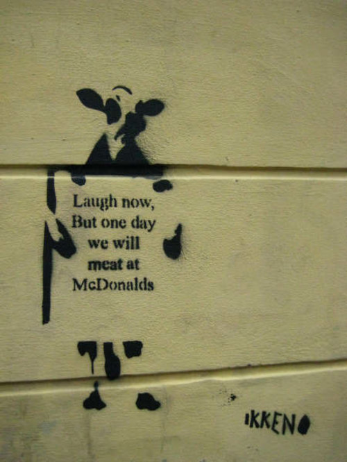
Ikkeno's parody of Banksy is funny and has an more overt messege than Banksy's "laugh now but one day we'll be in charge" monkey, while the copying shows how big Banksy really is, this one was found on the streets of Oslo.
New Banksy...
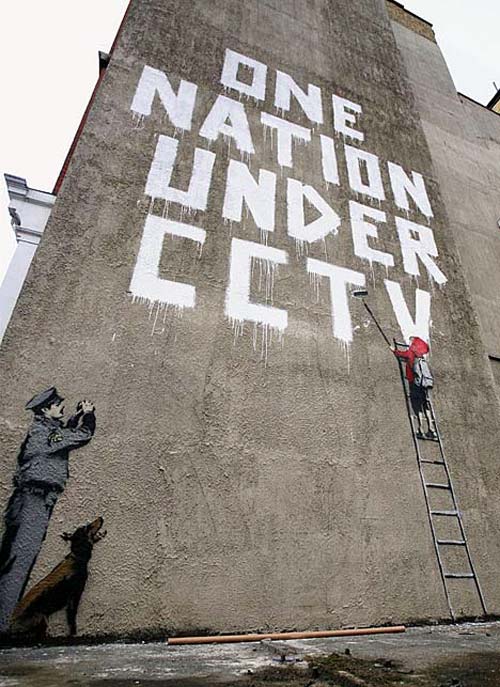
New banksy, same style, good message, but not one of his better works if im honest, its a little bit easy, doesnt have that spark of genius that a lot of his other stuff has.
Zach Smiths Sketchbook...

http://www.zaxart.com/sketchbook/
This is Zach Smiths sketchbook, every day he uploads another image that hes drawn that day. This is a virtual sketchbook collection, a good way in my eyes to get work out there and people seeing it, as well as keeping you motivated to keep on posting. It also would make you a lot less shy about your work.
The depot project...
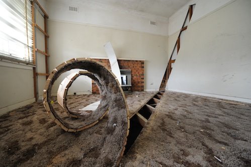
http://depot-installation.blogspot.com/
A old historic bus station was given over to 7 artists, this sculpture in particular i like, i like things that manipulate the everyday environment and turn it into something wierd. Its a shame that this building will be knocked down.
The future of books...

http://www.kylebean.co.uk/portfolio.html
This piece is intitled the future of books, i think this is a really cool reinvention of something, its a simple idea, but by paying careful detail to all the elements it comes together and works really well.

Wheres wally...
Where On Earth Is Waldo?
Really fun idea, basicly this group has put a giant waldo/wally on top of a building and are waiting for it to get photographed by a satalite so that the wally shows up on google maps, clever and inventive, its a simple idea that just works really well.
Jen Stark...
 Jen Stark
Jen Stark uses layers and layers of paper, intricately cut into paper sculptures. I love these, they make something thats both delicate and beautiful out of everyday materials, and the level of commitment to the work to create this is staggering. The sculptures look almost alien, i would love to see these applied over a bigger sculpture, perhaps erupting from a 3d object or somesuch.
Wednesday, 23 April 2008
My own promo work...

Me and a couple of mates are putting on a night in Leeds, i did all the flyers/posters, this is one of them.
Friday, 18 April 2008
pantone masterpiece...

tim fraser brown has created this "manetone" Édouard Manet’s, ‘Bar at the Folies Bergere’ out of old pantone chips. Anything built up of lots of small components in a suprising way i love, i think it brings another level of coolness to the whole thing. its framed as if in a gallery also, adding to the effect, everything is considered.
Tuesday, 15 April 2008
Monday, 14 April 2008
get a dog

get a dog by Siggi Eggertsson. These are sold on the site ifyoucould.co.uk as limited edition screenprints. I love the limited colour pallet and the dog thats made up of the small trianglar shapes. I like anything that breaks down into the smallest possible building blocks and starts from there. It gives the piece a sense of unity about it.
Sunday, 6 April 2008
giraffes united...

Another funny Tshirt design from threadless. I love lighthearted design like this parodying more serious causes. At first glance you could think it was a serious message. This design shows how even with simple design/icons you still can be witty.
Wednesday, 2 April 2008
Dan mumford

Absolutely incredable a0 print, so much detail all combining with excellent use of colour. I wish i could illustrate to this standard, something to aim for hah.
Sunday, 23 March 2008
more reasons not to go camping...

really cool illustration by dan grzeca, "more reasons not to go camping". shows how with a limited pallete you can still create really striking images. Its got a sense of fun to it and a strong visual style that holds the whole thing together. Critically i find it slightly ambiguous in areas and the composition could be better.
Monday, 3 March 2008
revamping graphic equalizer...
Revamped Graphic Equalizer from Marcelo Costa on Vimeo.
fun video piece from marcelo costa. Taking something we see a lot of, and displaying it in a fun new way. I think he could of chosen a lot better song for it, and some parts of it where slightly sketchy, but the concept is very cool, must of took him a lot of time to make as well.
Friday, 29 February 2008
Running the numbers...


Plastic Bottles, 2007
60x120"
Depicts two million plastic beverage bottles, the number used in the US every five minutes.
Chris Jordan is an artist thats looking at the statistics of consumption and putting them in a visual format thats engaging and makes you realise how much we really do use. It really makes you think about what we're doing to the planet and the sheer enormity of our consumer habits. They seem to be a lot more striking in person as well. The canvases being massive and overbearing. All of this rings home the message.
http://www.chrisjordan.com/current_set2.php?id=?view=XXX_09NNN/
Eboy...

Eboy is one of the leaders in pixal art, one of my favourite designers.
http://hello.eboy.com/eboy/index.php
Crap Hound 7...

Crap hound is a magazine that basicly uses loads of stolen images/clipart to make up composite layouts and mosiacs. Its a style that works really well, suprisingly. If someone said to you, here this is a comic made of clipart, you'd probably laugh in their face, but not so with crap hound! It shows that by remixing old images something new and cool can be made. Theres nothing new under the sun...
http://readingfrenzy.com/shoppe/magazines_and_zines/284/
Monday, 25 February 2008
Classic book modification...

Hollowed out books are almost a cliche but done well its always a suprisingly useful way of hiding stuff. I like how professional these are, you can't tell from the outside that theres anything amiss. This is the first and most obvious modification of a book, but is a launching pad to seeing a book differently, something i want to focus on in this current project.
http://www.secretstoragebooks.com/
Cigarette box books...

Tankbooks, "tales to take your breath away" these are classic novels packaged in cigarrette boxes. These are really cool. Cigarette packets are iconic and i love anything that twists the tradional use of something is good in my book. Practically i dont know how well these will work, as a cigarette box is pretty small for a novel. This seems to be one of those conceptial "cool" bits of design with no real practical widescale use, but need to exist to keep the design world fresh. The covers lend themselves quite well to the scale though, and anyone seeing them would unlikely guess it contained a book until close inspection.
Obey Giant

Shepard Fairey, the man behind Obey Giant is a bit of a hero of mine. Ive loved his stuff for years and i tend to horde anything i can find by him. I just agree with his philosphy of taking back urban space, and "the medium is the message". In his words-
" The Obey campaign can be explained as an experiment in Phenomenology. the first aim of Phenomenology is to reawaken a sense of wonder about one's environment. The Obey Campaign attempts to stimulate curiosity and bring people to question both the campaign and their relationship with their surroundings. Because people are not used to seeing advertisement or propaganda for which the motive is not obvious, frequent and novel encounters with Obey propaganda provoke thought and possible frustration, nevertheless revitalising the viewer's perception and attention to detail."
His work is usually screen printed, and as such uses few colours. this adds to the impact of his pieces as the red, black and white create a strong colour field when lots of posters are put together in the same spot. The whole campaign is obviously inspired by propaganda, such as russian communist propaganda, and from the book and film 1984. Dystopian future literature is another of my loves so it all works out nicely.
Pencil Sculptures by Jennifer Maestre

Jennifer Maestre creates amazing sculptures out of the end of coloured pencils. The pencils take a very organic form when put together in this way. Reminds me a lot of an alien world type of formation. The cross between alien and something as mundane as a pencil is brilliant, and this work has reminded me to keep on looking at things differently, not always going with the expected use of something.
http://www.jennifermaestre.com/pencil_show.html
On The Road Of Knives...

On the road of knives is a collabrative project between Zak Smith, Shawn Cheng and Nicholas Di Genova. They are all amazing illustrators, and on the road of knives is basicly them drawing different monsters to fight each other or as the website says
"this is how it works: Zak draws something. Shawn draws something that will fight it. Zak draws his thing fighting back. Shawn draws his thing fighting back and maybe tripping over a statue. Then maybe Zak's thing kills Shawn's with the statue's head. Then Shawn draws a new thing. Zak's surviving thing attacks it. And so on. Zak and Shawn got things started, and now Nick has joined the fray. Though not exactly an exquisite corpse, it will be exquisite, and there will be many corpses."
I love the style of all 3 and the styles are different enough that each monster is completely different to the next, while the dark line drawing style unites the pieces together. Its a fun project, something you might do yourself with your mates when bored, but taken to a completely differerent cool level by the quality of the artwork. I would love any of the frames up on my wall, the quality throughout is outstanding.
The only quibble i have is as a set its hard to understand exactly whats going on, but thats mainly because it was drawn as a series of epic pieces, not as a flowing comic strip.
http://www.roadofknives.com/redux/01-10.shtml#001
Sunday, 10 February 2008
internet was closed...

love this tshirt from threadless, its a cute message that shines light on our computer culture. Im not too fond of the green colour, but its appropriate to the "get outside" message.
Subscribe to:
Comments (Atom)