Thursday 24 April 2008

Felice Varini...


http://www.varini.org

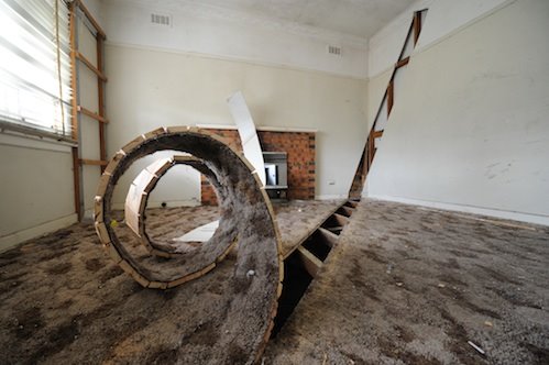
Felice Varini is amazing, he basicly takes locations and then paints on a pattern so that from a certain angle it looks like there are perfect geometric shapes in allignment, i would love to do this to one of my rooms in my house, its a really cool visual effect.

Paul Alexander Thornton...


http://www.myspace.com/paulalexanderthornton

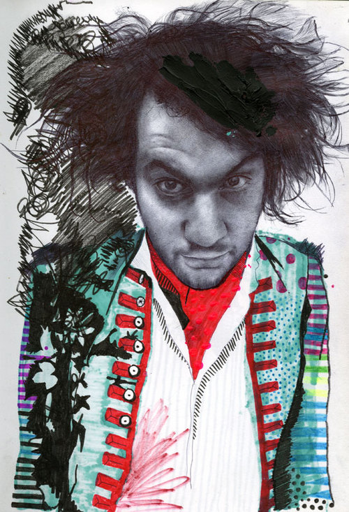
Paul Alexander Thornton has a really cool illustration style that i dig. It mixes roughness with very accurate drawings, i love that contrast between messy and precise, i wish i had the talent to draw like this.

Ikkeno's Banksy parody


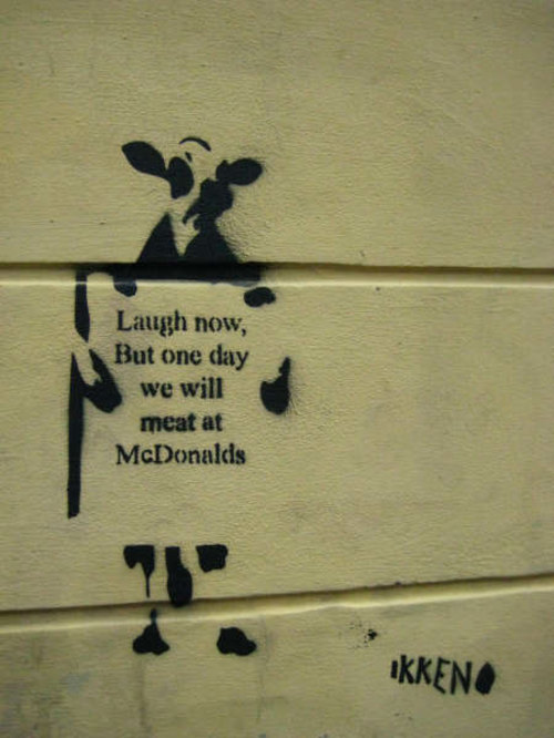
Ikkeno's parody of Banksy is funny and has an more overt messege than Banksy's "laugh now but one day we'll be in charge" monkey, while the copying shows how big Banksy really is, this one was found on the streets of Oslo.

New Banksy...


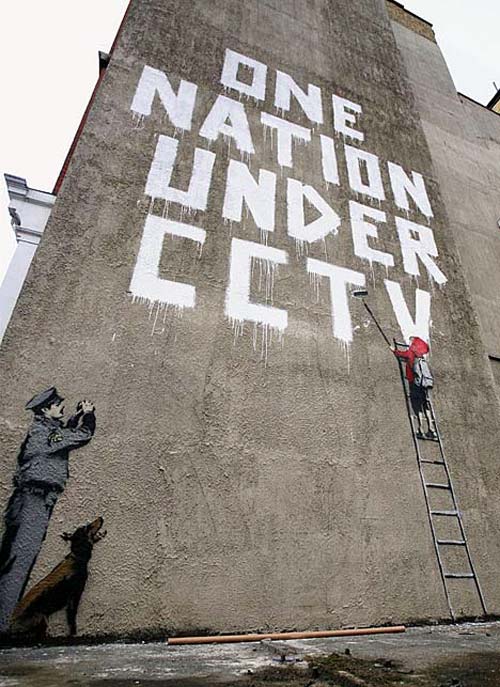
New banksy, same style, good message, but not one of his better works if im honest, its a little bit easy, doesnt have that spark of genius that a lot of his other stuff has.

Zach Smiths Sketchbook...


http://www.zaxart.com/sketchbook/

This is Zach Smiths sketchbook, every day he uploads another image that hes drawn that day. This is a virtual sketchbook collection, a good way in my eyes to get work out there and people seeing it, as well as keeping you motivated to keep on posting. It also would make you a lot less shy about your work.

The depot project...


http://depot-installation.blogspot.com/

A old historic bus station was given over to 7 artists, this sculpture in particular i like, i like things that manipulate the everyday environment and turn it into something wierd. Its a shame that this building will be knocked down.

The future of books...


http://www.kylebean.co.uk/portfolio.html

This piece is intitled the future of books, i think this is a really cool reinvention of something, its a simple idea, but by paying careful detail to all the elements it comes together and works really well.

The work of Clare Mallison...


http://www.claremallison.com/

I love this style of illustration by clare mallison, it seems sketchy but the whole thing comes together really well, and has real character, something i possibly want to aim for within my work.

Wheres wally...


Where On Earth Is Waldo?

Really fun idea, basicly this group has put a giant waldo/wally on top of a building and are waiting for it to get photographed by a satalite so that the wally shows up on google maps, clever and inventive, its a simple idea that just works really well.

Jen Stark...

Jen Stark


Jen Stark uses layers and layers of paper, intricately cut into paper sculptures. I love these, they make something thats both delicate and beautiful out of everyday materials, and the level of commitment to the work to create this is staggering. The sculptures look almost alien, i would love to see these applied over a bigger sculpture, perhaps erupting from a 3d object or somesuch.

Wednesday 23 April 2008

My own promo work...


Me and a couple of mates are putting on a night in Leeds, i did all the flyers/posters, this is one of them.

Friday 18 April 2008

pantone masterpiece...


tim fraser brown has created this "manetone" Édouard Manet’s, ‘Bar at the Folies Bergere’ out of old pantone chips. Anything built up of lots of small components in a suprising way i love, i think it brings another level of coolness to the whole thing. its framed as if in a gallery also, adding to the effect, everything is considered.

Tuesday 15 April 2008

Monday 14 April 2008

get a dog


get a dog by Siggi Eggertsson. These are sold on the site ifyoucould.co.uk as limited edition screenprints. I love the limited colour pallet and the dog thats made up of the small trianglar shapes. I like anything that breaks down into the smallest possible building blocks and starts from there. It gives the piece a sense of unity about it.

Sunday 6 April 2008

giraffes united...


Another funny Tshirt design from threadless. I love lighthearted design like this parodying more serious causes. At first glance you could think it was a serious message. This design shows how even with simple design/icons you still can be witty.

Wednesday 2 April 2008

Dan mumford


Absolutely incredable a0 print, so much detail all combining with excellent use of colour. I wish i could illustrate to this standard, something to aim for hah.